
A Bold New Look
Since 1978, we’ve partnered in faith to empower ministries across the LCMS. Now, with our bold new look, we’re building on that legacy to better serve you today and for generations to come.
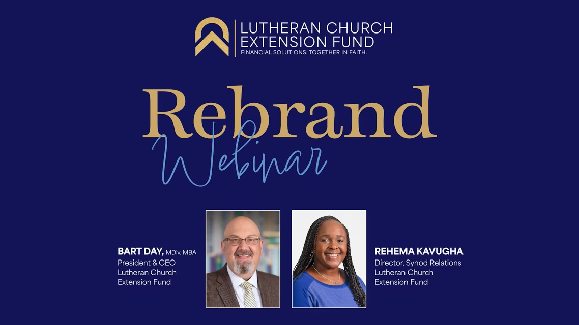
A Fresh Chapter, Rooted in Faith
For decades, Lutheran Church Extension Fund (LCEF) has faithfully supported The Lutheran Church—Missouri Synod (LCMS) in its mission to share Christ’s love with the world. As we unveil our bold new look, we are reaffirming the core values that have guided us while paving the way for an even brighter future.
This rebrand:
- Marks the beginning of a modern, enhanced experience for investors, borrowers and partners.
- Will better equip us to meet the evolving needs of the ministries we serve.
Discover the vision behind our rebrand and what it means for you.
Our Mission
To start, sustain and strengthen LCMS ministries through financial and strategic partnerships.
This drives everything we do and fuels our passion for empowering churches, schools, organizations, workers and members to grow and thrive.

A Closer Look at Our Logo and Colors
The Mark
A unique and uplifting mark, our new shield leaves a lasting impression. Whether you see the cornerstone of an ascending structure, a mountain splitting the sky or a simple arrow pointing upward toward a higher purpose its meaning is rooted in a shared mission to serve God and His church.
Color Palette
The gold and blue colors symbolize strength, control, trust, premium quality and a sense of timeliness reinforcing LCEF as a respected financial partner of the LCMS.
Typeface and Structure
The mark’s vertical, upward momentum reflects growth and faith in action, while the sans-serif font balances modernity and grounding. The contrast between bold and refined elements symbolizes the balance of strength and stability.
Visual Harmony
Through its angular and curved lines, color contrasts and weight balance the design creates a distinct identity that stands out while remaining deeply connected to our purpose.
Looking Ahead
A Tagline That Reflects Our Heart
FINANCIAL SOLUTIONS. TOGETHER IN FAITH.
This tagline underscores our role as a collaborative, faith-driven financial partner. It’s a reminder that we don’t just provide financial services — we walk alongside you and your ministry in faith, working together to build the church of tomorrow.
Need Updated Materials?
Learn More About Our New Brand
Our bold rebrand and redesigned website reflect our mission to empower LCMS ministries and individuals with faith-driven financial solutions.